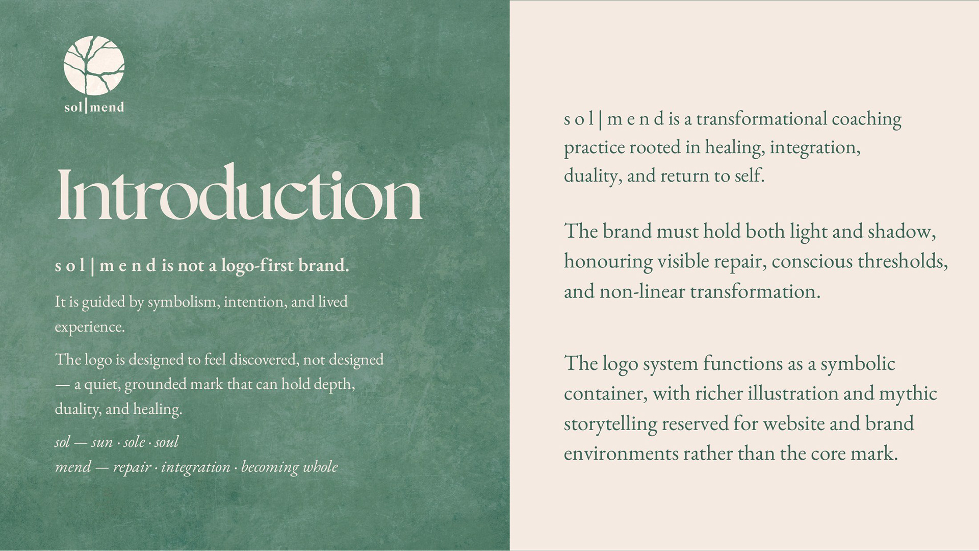
A brand identity and website for a coaching practice rooted in healing, integration, and return to self.
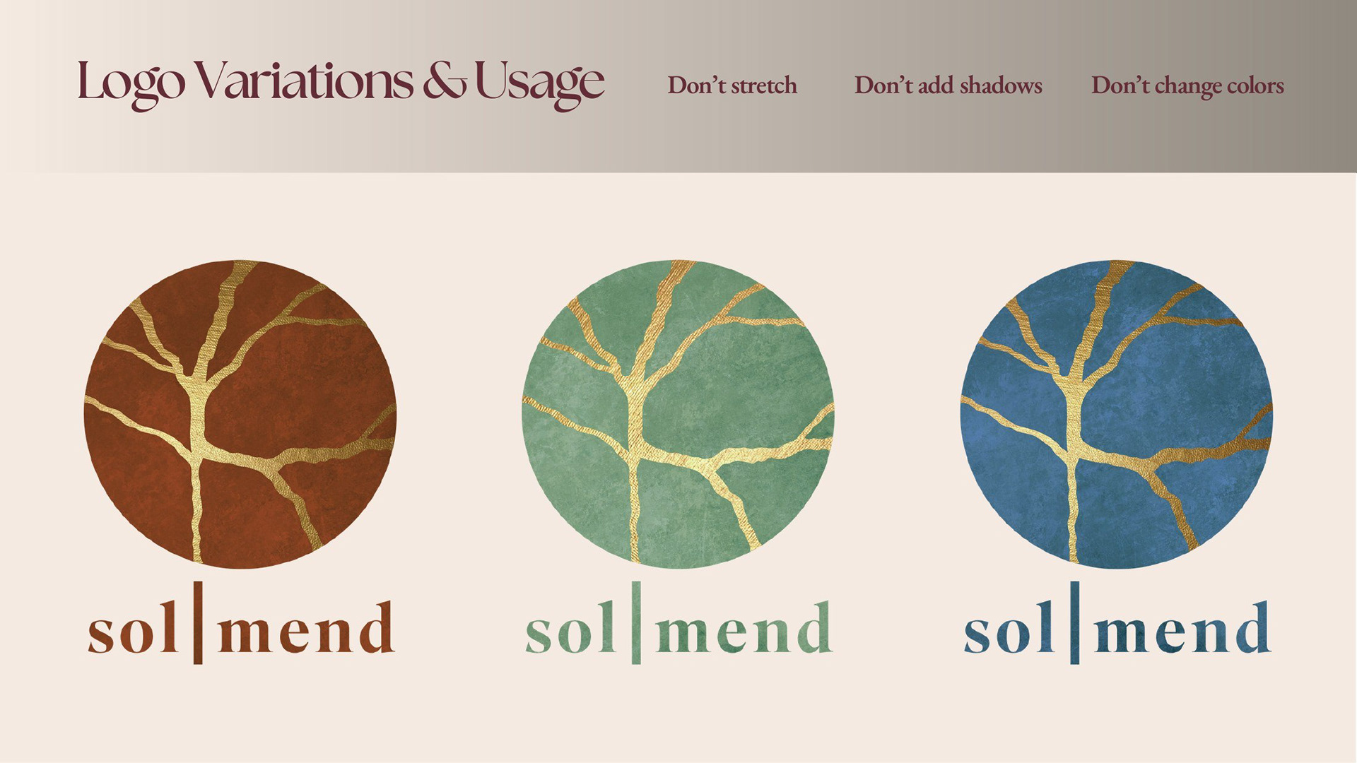
The mark comes from kintsugi, the Japanese art of repairing broken vessels with gold. A circular form, fractured and mended, with a variation that runs like a river through it. Healing you can see, and don't have to hide.
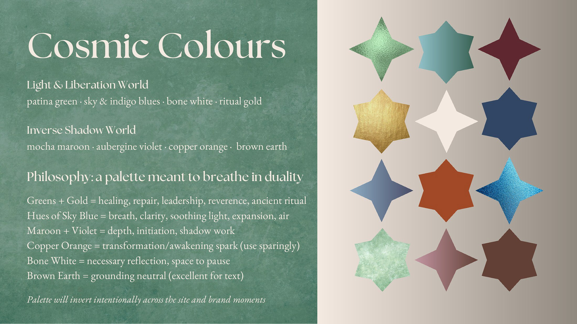
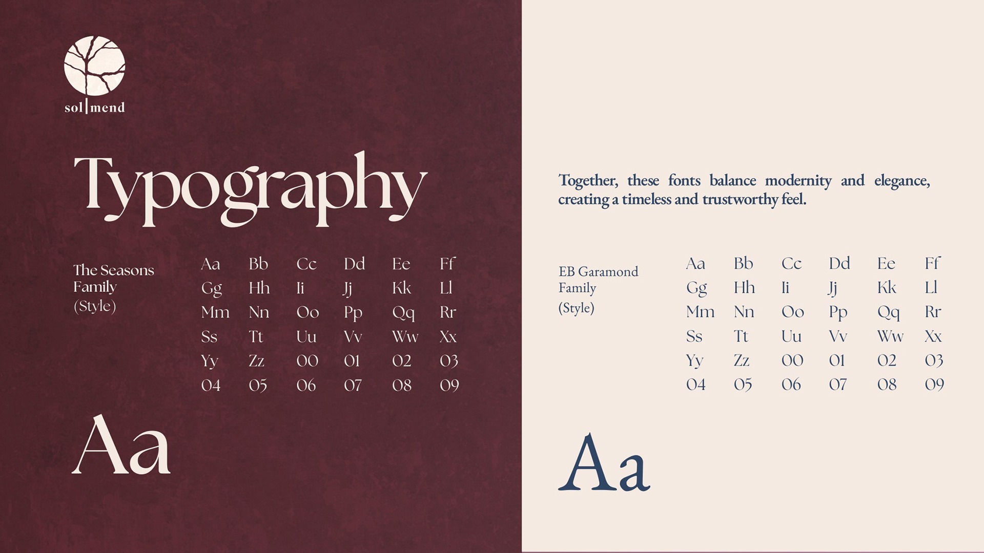
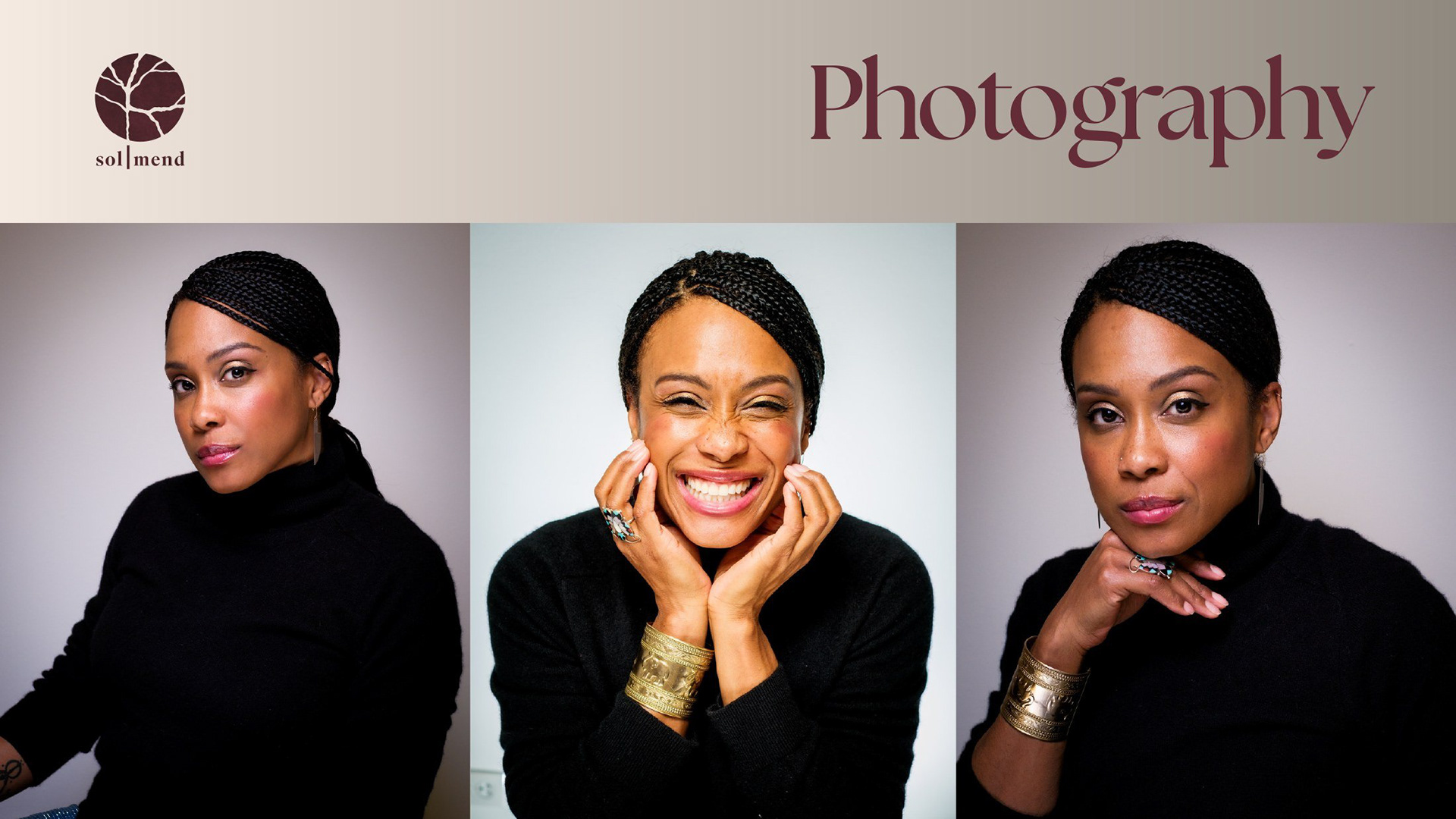
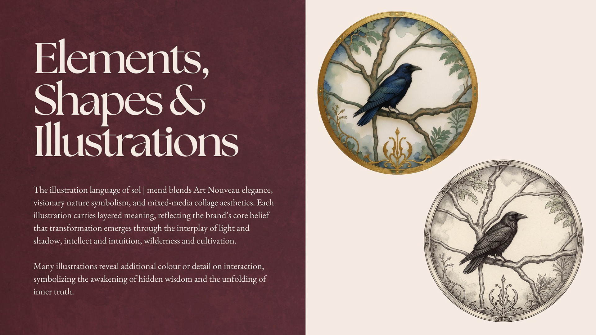
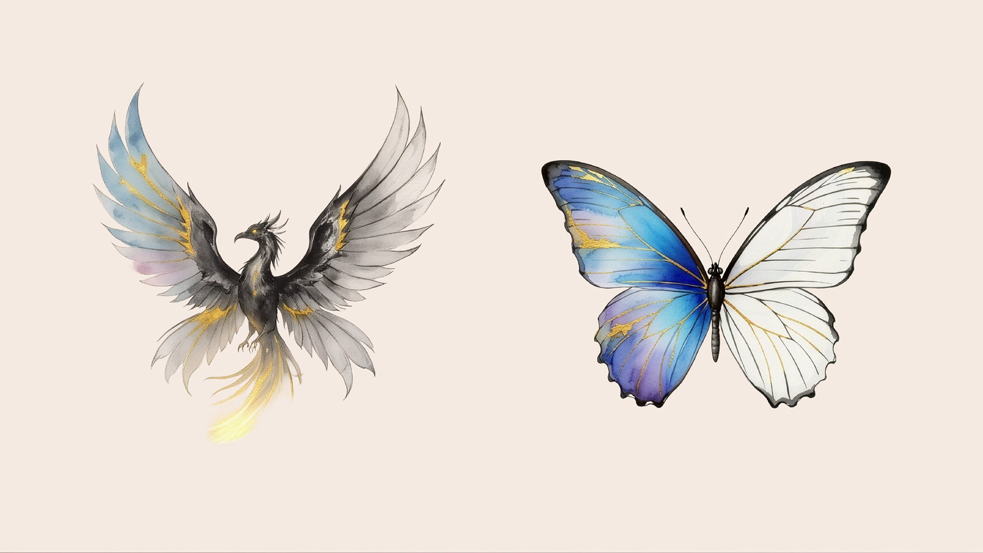
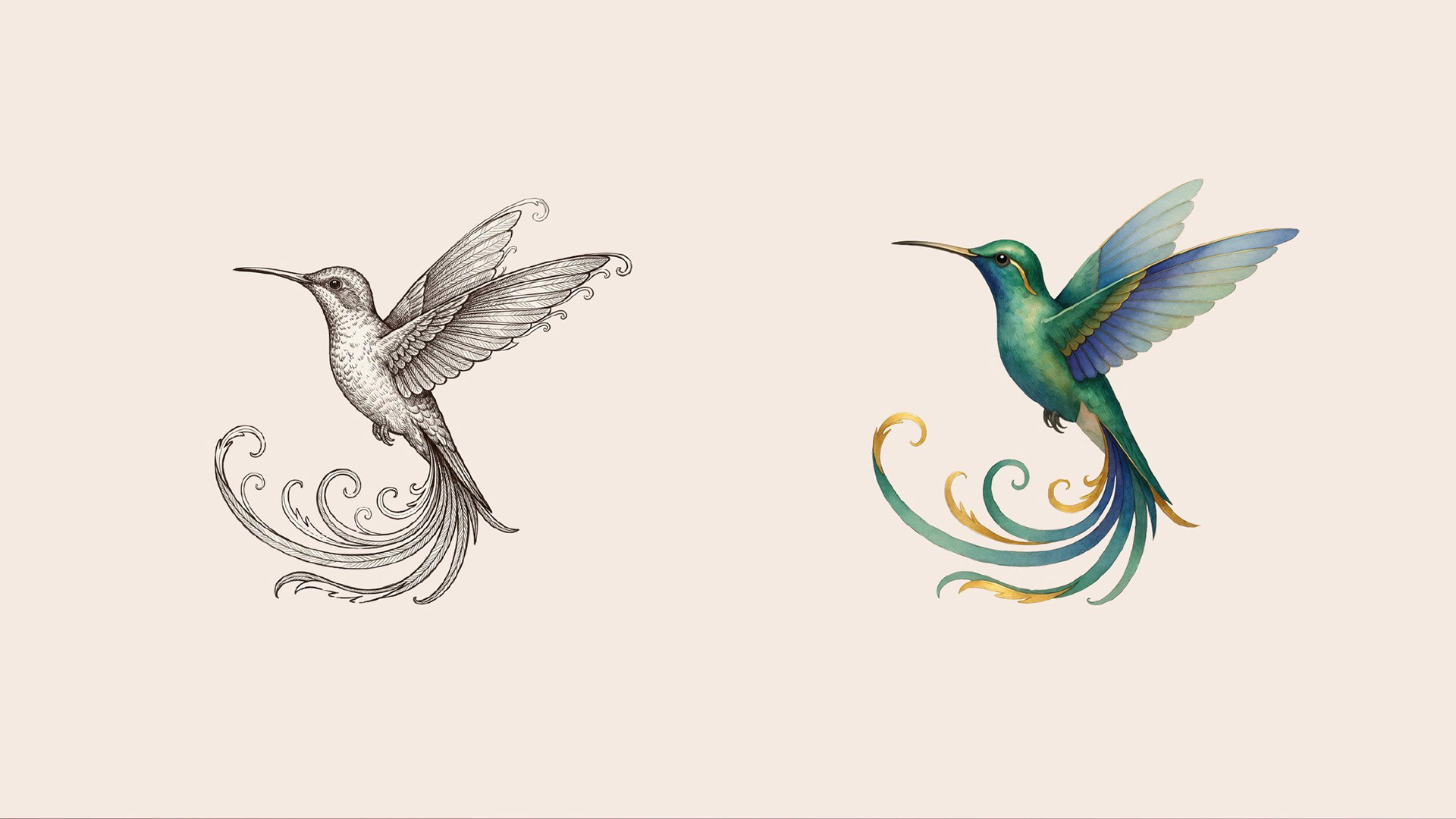
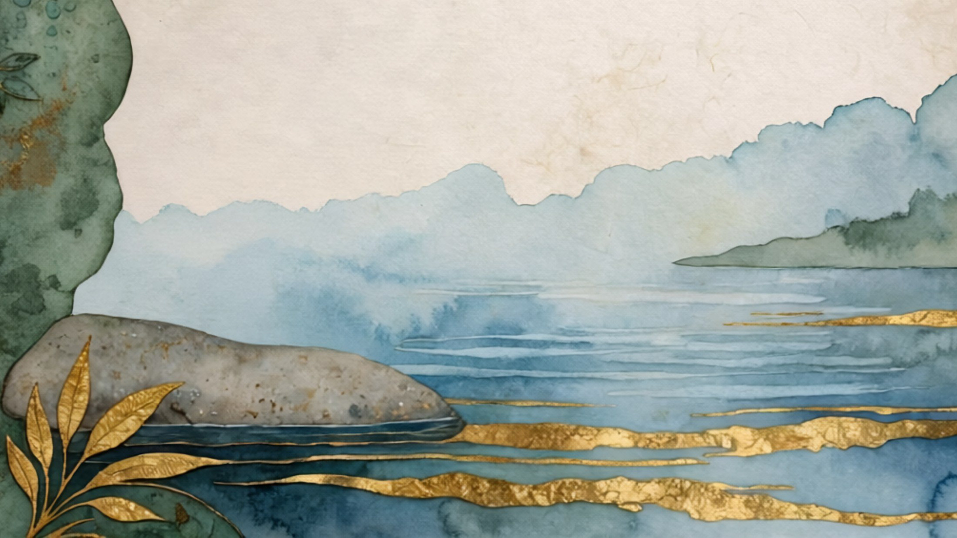
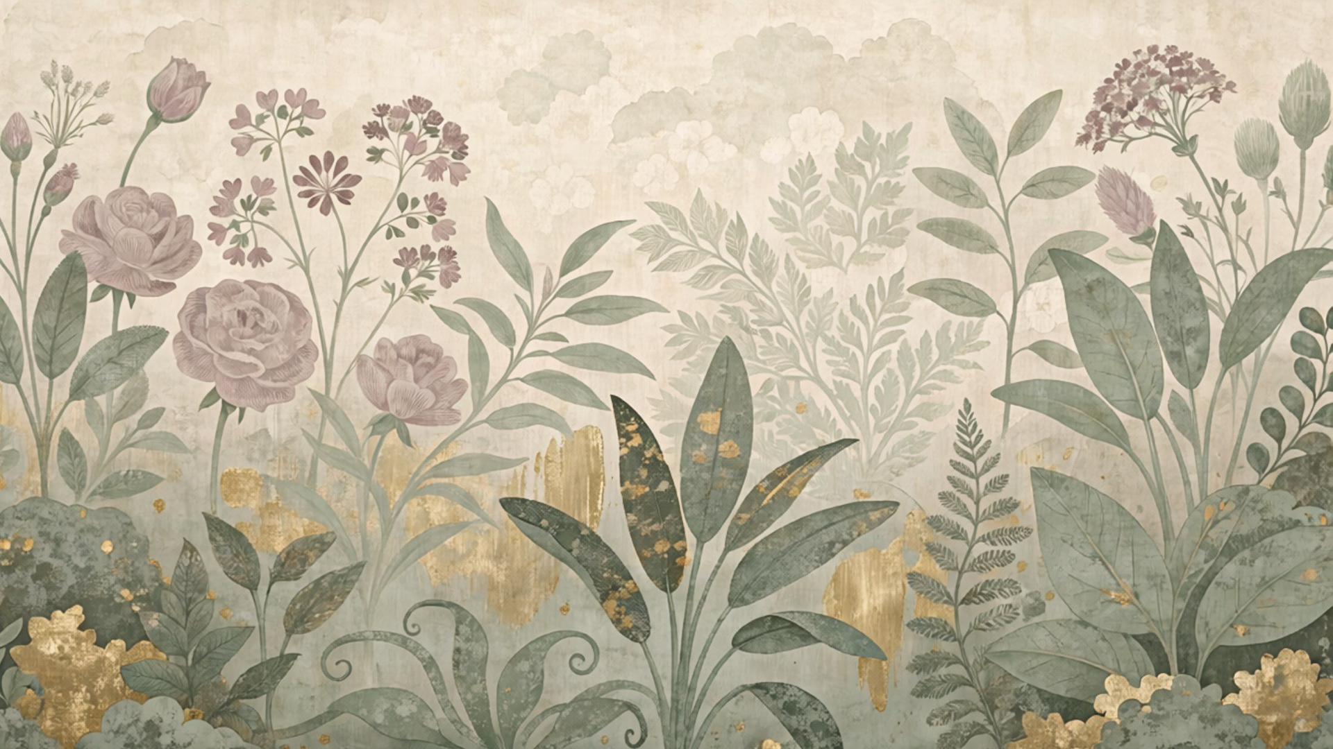
Logo system and colourways, a palette built to invert between light and shadow, typography, photography direction, and original illustration drawing on Art Nouveau line, nature symbolism, and mixed-media collage.
Brand identity, style guide, illustration, and website design and development, through to launch.